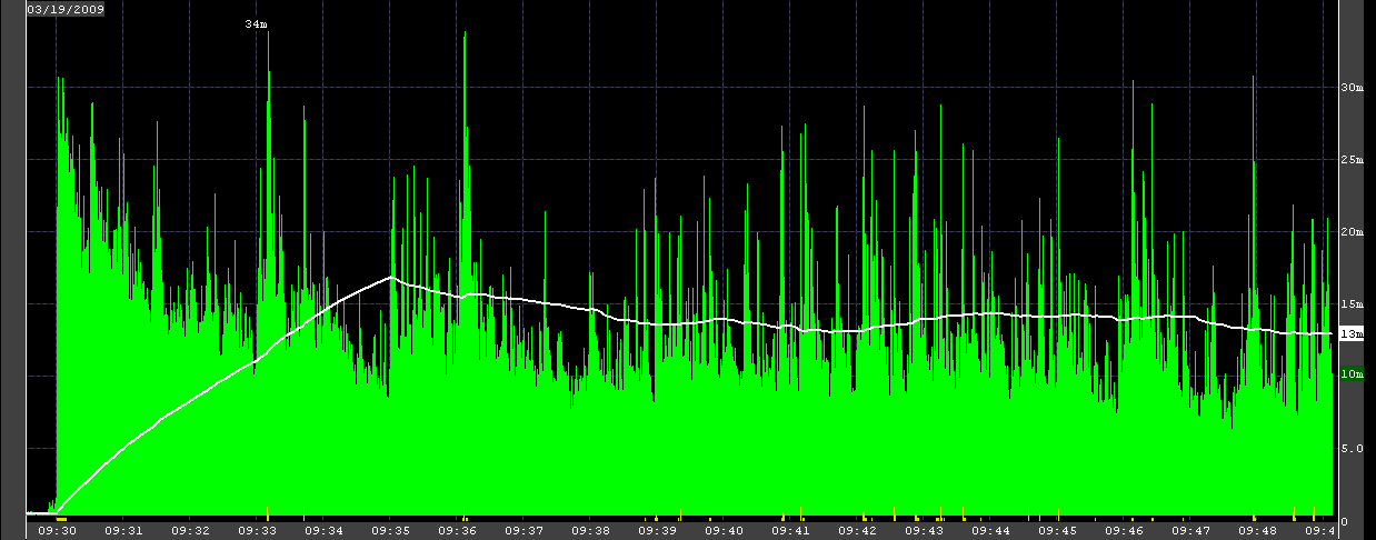
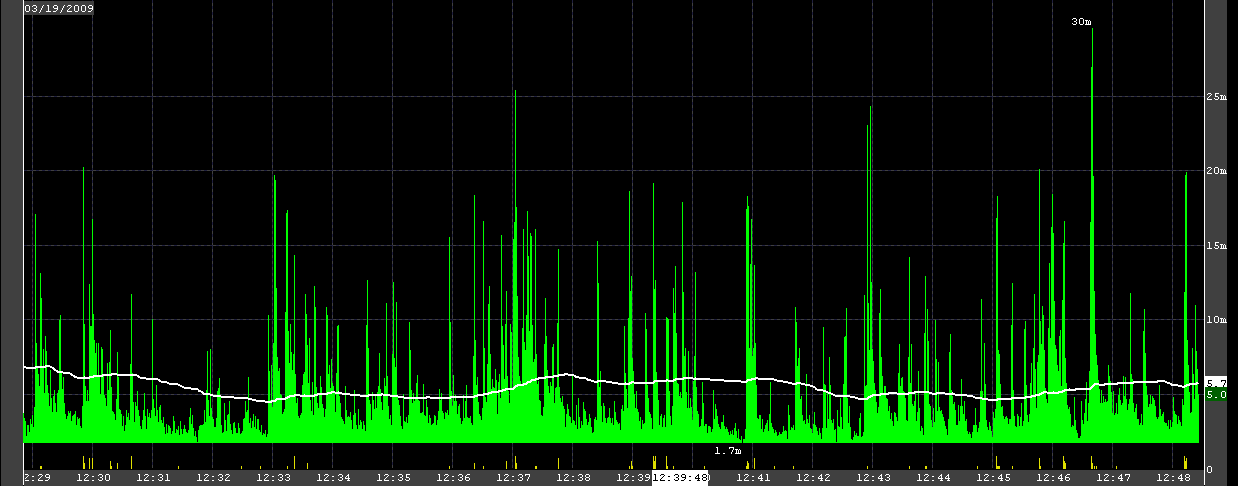
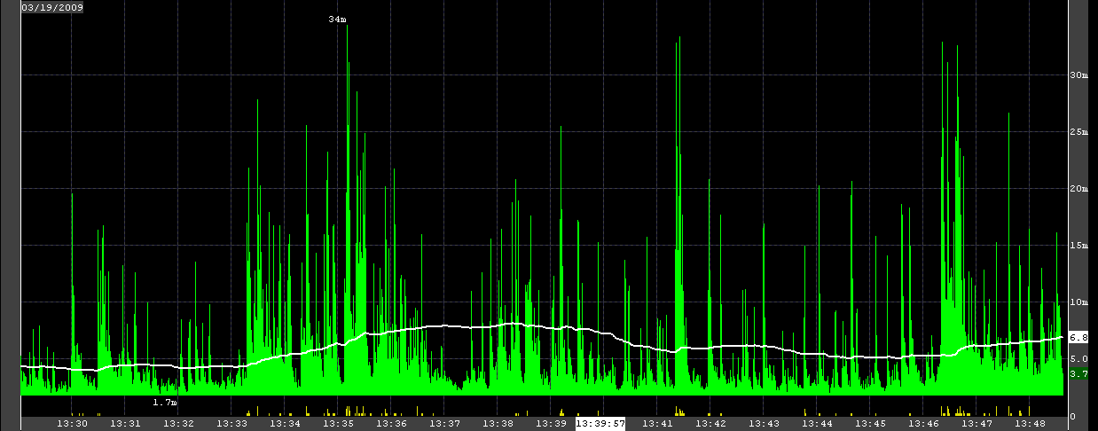
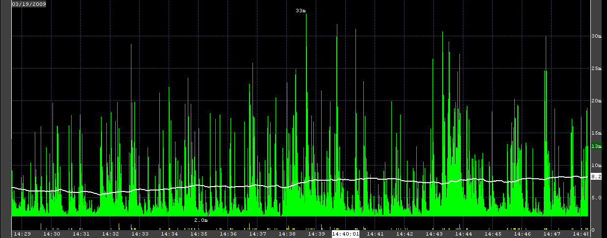
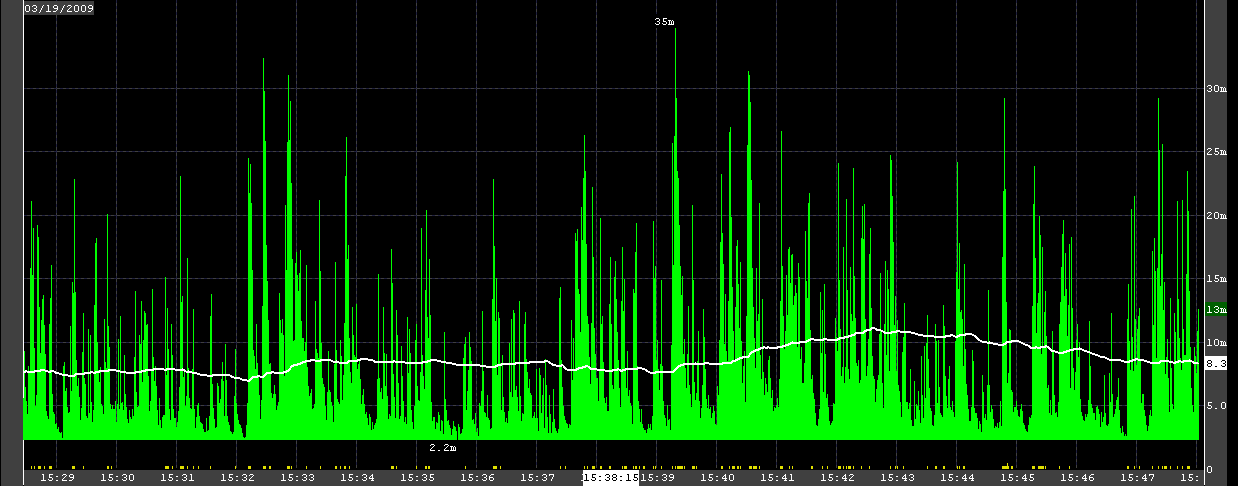
These pictures are from NxCore servers receiving real-time market data from all the exchanges.
They demonstrate the choppiness of real-time market data coming from the exchanges.
The green is the bandwidth, in MBPS -- you can see the scale on the right side of each chart.
Your own NxCore graph should be very spiky also -- spikiness in market data is good, it shows that you are receiving truly real-time data.
The graphs below contain all the data being processed by NxCore servers -- 90% of that data is option quotes.
Your own charts may be different depending on the data you are receiving.
Take a look at each of the below charts, starting with 9:30
09:30AM. Notice the flood of traffic spiking to 30mbps, and then periodic spikes to 34mbps.
10:30AM. Notice the periodic thick bands of peaks, varying from 30mbps down to 5mbps, and then spiking back to 30mbps

11:30AM. Notice the bands are widening out.

12:30PM. Lunch time
13:30PM. Lunch time concluding, activity is picking up.
14:30PM
15:30PM
NxCore API Documentation. Copyright Nanex, LLC and Eric Scott Hunsader, 2003-2009 (c). All rights reserved.